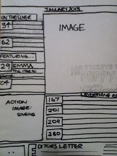
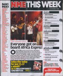
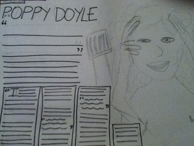
These following images will be used tomorrow for inspiration when I take photos for the front page magazine.
Thursday, 31 January 2013
INTERVIEW QUESTIONS
This questions are the questions I will consider when asking questions in the interview, I can elaborate on this question which creates the interview like a conversation;
1. We know you’re in the midst of your coursework at college, how do you find time to focus on and enjoy your music?
2. How do you find time for music when you’re in the midst of your coursework in college?
3. Who has inspired you to become this amazing singer that you have moulded yourself into today?
4. When us back at base listen to you music; you don’t sound like the average artist, to you personally what is music about? Is it about the fame or merely just for the ways in which you show you emotions and lets others understand you?
5. When you producing your music, do you enforce what you feel into your music?
6. I see that you have your own sound cloud page, how do you feel with people listening to your music worldwide? And to you do you feel the number of people listening to your music.
CONTENT PAGE PHOTO SHOOT
These are the photos I have taken for the contents page
Monday, 28 January 2013
SHOT LIST
Date, time and purpose of photo shoot (e.g. front cover shots, DPS Shot)
|
Location incl. Features of the mise en scene
|
Model/artist needed incl. Costume and props
|
Types of shots e.g. distance, angle etc.
|
Notes on the shoot e.g. number of camera used, problems/successes.
|
25/01/13 Some pictures for Contents Page
|
Photography studio, MS1. Dark clothes with a hint of bright colour.
|
Shria Mavji, possibly with a microphone.
|
Mid Close up or Long shot.
| |
Featured Photo shoot, Front Cover images.
|
Photography studio, Black clothes with red lipstick or a colourful accessory.
|
Emma Lenihan, an instrument; ukulele.
|
Medium Close up, High and Low angles.
| |
Double Page Spread Image
|
Outside; Colourful Clothes with dark make up.
|
Emma Lenihan, guitar in the woods.
|
Long Shot, High Angle.
|
This shot list will help when it comes to the photoshoots as it will help me when referring back to previous ideas, and help to keep a structure when taking the images. After all the images are taken I will upload some of the notes (blank column on table) later on.
FLAT PLAN EVALUATION
From the feedback for the flat plan, the flat plan could be more appropriate for the target audience in the materials, the flat plan could have more variety and more detail in the fonts and text size. Also, the text and the images could integrate more.
The Flat plan was successful as the text on the front cover goes well with the contents page. The Flat plan could be improved by adding more page numbers on the contents age, to refer back to the text on the double page spread.
Overall, I will make sure that the magazine will have a variety of text and a suitable amount of fonts to be successful. Also, I need to make sure I include page numbers on every page, so it follows the conventions of referring back to the content page for page numbers in a music magazine.
Tuesday, 22 January 2013
FLAT PLAN FEEDBACK
This is the feedback from someone who analysed my flat plans and has given ways in which to improve. I will take into consideration the comments that have been made into my final magazine.
DRAFT FLAT PLAN
These are the flat plans that I have been working towards for the past couple of days,
The flat plan consists of :
- Influenced by research,
- Medium Close Up Shot on front page,
- Has a range of cover lines; different sizes.
- A minmum of 4 different images.


Tuesday, 15 January 2013
DESIGNING A FLAT PLAN
What must be included??
I am going to be referring to this work throughtout the designing on the flatplan.
I am going to be referring to this work throughtout the designing on the flatplan.
- It must be as detailed as possbile with text and colour complted. It should look like your completed magazine will do. (apart from the interview).
- You should show how your research has influenced the design of the flat plan and ahouls include a minimum of 4 different images.
- The design can and willl change and adapt but you must always explain and justify these changes.
- At the end, the finished magazine should be recognisable from the flat plan.
Monday, 14 January 2013
MARKET RESEARCH FOCUS GROUP
This is my Focus Group on two magazines; NME and Limelight.
Sunday, 13 January 2013
MARKET RESEARCH ANALYSIS (MULTIPLE CHOICE)
For this analysis, I am going to go through the main questions in which my multiple choice survey was answered.
From these answers, it shows that people think that who is being featured and the price is most important, while the colour scheme and posters are least favourited. This suggests that all though these all need to be covered, the main featuring and the price is what I need to focus on to meet the preferences of the magazine readers.
ANALYSIS OF THE ARTICLES IN DOUBLE PAGE SPREAD
After Miss Burne's lesson; in which we were analysing the article/interview in 'Grazia Magazine' of the double page spread, we found that the image and the cover line were really related and we could see the contrasts of the two meanings init (I will post about this later on). Also, it showed that it all link with fashion and celebrities involved in fashion. Miss Burne then set us work, to go back to our inital research and analysize the text in their double page spreads.
AUX MAGAZINE (part 1 and standfirst of the article)
Language and techniques that were used in the double page spread:
- It included lots of information about past and present upcoming events that Ellie Goulding has had, letting the reader feel like they know more about her.
- The language is 'chatty' and excited; 'Oh, and for the past year, she has high-profiled relationship with arena-dubstep start Skrillex'; this makes us feel like the writer has gossip and is almost boosting about how 'close' they are relationship wise with Ellie.
- Short persuasive sentences, followed by imformative longer sentences make it seem like their building up to something big and important.
- The title is almost like it hand written, give it a personal touch and making the reader feel more like the magazine is personal friends with Ellie.
CLASSIC ROCK MAGAZINE
Language and techniques that were used in the double page spread:
- More of an article than an interview, story like.
- Talks about personal issues; Anfy Fraser getting HIV at the age of 15.
- Rule of 3 in standfirst, emphasises how he was angry when he went of the rails.
- Sometimes like interview as Andy chips in with quotes, giving it a personal touch.
- The standfirst is almost hand written making it seem more like Andy Fraser has gone into depth in this article.
SECOND SURVEY RESPONSE ON Q AND A
This is another respondents answer for my survey, created on survey monkey, in the following analysis i will give explanations and what I could use from
EXPLANATIONS
QUESTION 1
This respondents suggestions were that it should have pop colours with rock themed colours, so a mix of the two; suggesting it will create a pop rock atmosphere.
QUESTION 2
This answer suggests that it should
habe really bright coloured text with a rock feel by using straight
font with no curves at all. Also they suggested that there should be
a mixture of hand written type font with bold striking font to get
the best out of both genres.
QUESTION 3
This answer suggests that it would be
good if the background was really dark againist poppy text colour or
even image. And vice versa.
QUESTION 4
This respondents answer suggests that
most rock band or artists even have a lot of tattoos and peircings,
creating the feelof rock however with a pop magazine they suggested
that girly “ice cream” colours could be used and the mise en
scene but also that these colours work with a younger audience. So I
need to mix the two in a way that is ment for teenagers but still
creating a rock and pop feel to the magazine.
QUESTION 5
This answers shows that they are prepared to pay £1.01 to £1.99 for a monthly magazine. This suggests that my magazine needs to be relatively cheap, but also realistic for a monthly magazine.
QUESTION 6
This shows that they prefer to pay for a monthly magazine. This suggests that my magazine should be similar and be a monthly magazine aswell.
Subscribe to:
Posts (Atom)

.jpg)


